New logo form.
Two sided business cards that feature a fun biographical image on the back.
We set up a mini studio and shot portraits of every employee. There was only one mandate: Have fun. Photos by Don Lupo.
Even the agency dogs got their own cards.
The original office interior was designed as an art gallery, but the problem was the art collection had been relocated to a museum. All that was left was bare walls.
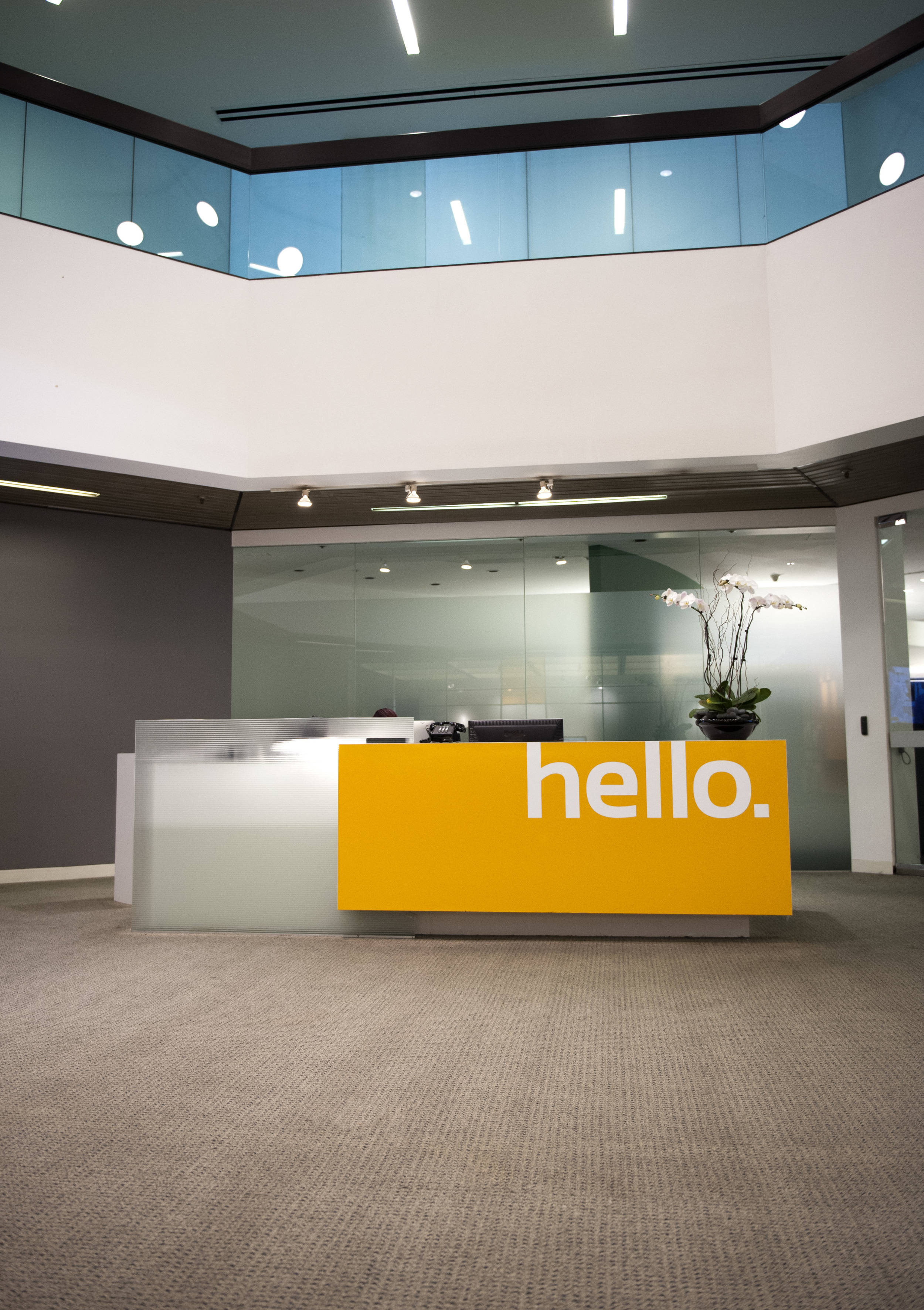
Main reception area was rebranded with new logo and color scheme.
The grahics established this space as a primary focal point using just type and color.
Branding at south entrance.
Branding at north entrance.
Visitors view of the conference room just off main lobby.
graphic identity system
DAILEY ADVERTISING:
Dailey & Associates has been around since the late sixties but had recently gone through a series of dramatic changes. Three new Executive Creative Directors, a new President and CEO, not to mention founding partner Cliff Einstein's modern art collection was moved out of the agency and into various museums around town.
Suddenly Dailey had new leadership, a very old logo and acres of empty white walls.
Time for a change.
I rebuilt the agency identity system from the ground up: new logo, new color scheme and new way of looking at the role of business cards.
Beyond the design fundamentals of clarity and simplicity my guiding principle was that people are what make a business run. So Dailey's employees became an important graphical element in the new identity.
The environmental space got a facelift as well. It's amazing what you can do with just two colors and some typography. It's no million dollar art collection, but it certainly added some badly needed chutzpah back into the agency space.


